Saturday, May 10, 2008

Grafting Technology Into Clothing

For a long time, people have thought about how “cool” it would be to have our electronics embedded right into the things we wear. Why carry your cell phone in your pocket when you can have it woven into your shirt? The realistic incarnation of this and other similar ideas have many flaws that prevent it from becoming a mainstream process. There are, however, many places where technology imbued clothing becomes highly sought after and extremely advantageous.

One of the first places I encountered this principal of high-tech clothing was actually through the book “Snow Crash” by Neal Stephenson. In the story, there are agents that walk around with their computers strapped to their bodies and are always plugged into the “Metaverse” (Snow Crash’s successor to the internet). In the book these people are called “Gargoyles” and are talked about with a negative connotation. The book goes out of its way however to make the things strapped to them as an extremely outlandish display of poorly grafted technology.

There is one particular area where integration of technology into clothing highly interests me and is being actively persued. Future Force Warrior is a US military initiative that is part of the Future Combat Systems Project. As our military heads into the 21st century, they are trying to develop more effective techniques to make our ground combatant more effective. One interesting aspect of the future force warrior is a new dichotomy between a network of both autonomous and remote controlled vehicles being controlled from anywhere in the world.

There are a lot of buzzwords that the military uses when describing what a soldier might look like by 2032. They want clothing and personal gear that uses anything from nanotechnology, artificially powered exoskeletons, to magnetorheological fluid, which is a science fiction holy grail of bullet proof armor. The one thing that the military does not particularly care about is whether or not the general public wants to wear these pieces of technology. For the military, the social stigmas that occlude technological garb in the standard civilian world do not exist.

The military uniform situation is another place where it is relatively easy to justify the existence of all of this technology embedded within the clothing. The military is notorious for going to extreme financial measures for incremental improvement in their fighting capabilities. If it can help a soldier be slightly more effective at his or her job without being detrimental itself, then it is a justified component to have included.

Throughout the past few hundred years, the uniform of an armed service man has changed only in material and look. Modern uniforms use sophisticated techniques to conceal and camouflage, while colonial troops displayed bright colors to distinguish friend from foe. I think that the future, however, is going to see an extremely large change in the concept of military uniform. If the military gets everything that they want within the next few decades, soldiers will have to “boot up” their uniforms and will be encased in a suit grafted with a mesh of sophisticated technological enhancements.

Final Reflection-- Why Vital Ideation isn't over for me.

Summary: I am still not sure about myself as a designer in the context of having gone through all of vital ideation’s lenses, because feel like I still haven’t tapped into a lot of the value of this course. So, I’m going to keep taking it, on my own. :)
Vital Ideation has not really felt like a course to me until this point. The course itself was a Spring 2008 course organized by Olin students, and the was the idea of viewing the world through different "lenses" to influence design. The reason I signed up for the course in the first place was largely instinctive. I was a part of the early meetings when students talked about their ideas for “student-led courses” when vital ideation came up as an idea, but the impulse for actually taking the class was twofold. The first thing to note was that I often told myself: “I would probably love that class,” or even “I’m going to end up taking that class, as busy as I may be.” The second thing of note was other people, who, especially later on would tell me “You know you’ll love this class” or “You know you’re going to take this class.” Well, I signed up, and I am very glad I did.
Now the semester is over, I’m supposed to be done, but I’m not. In fact I’m sitting in the middle of a lounge in the middle of the night trying to synthesize this course, trying to find what personal value is buried for me, and I can’t really find it. I can’t for the life of me think about how this course has made me truly different, in a truly factual and accurate way. That is not to say that I don’t think I’ve learned much from the course, but I feel like its true value is still not known to me. I really do think that vital ideation isn’t over for me at all. The semester has ended, yes, but the class is definitely not over. In fact, the class feels like it is ready to begin, as corny as that may sound. I feel very strongly that vital ideation for me has been nothing more than a springboard for something of personal value that I can’t discern yet. I’ve spent something around 50 hours this semester, with and without others thinking, reading, writing, but mostly talking about a lot of different topics. It is easy to say that the course was about a variety of design lens, and that the end result is a dozen students who are now more aware about their ability to apply lenses to design, but that’s not so true for me.
In the end, I didn’t spend too much time this semester brainstorming and ideating around specific topics like designing for fun, or ecomimicry, or anything remotely close to designing for the next guy. All those were topics for vital ideation, but none of these things hold any real value to me as design lenses. I actually felt like all of our talks were simply an opportunity to engage in discussion with other students and faculty about a variety of topics, and much of the value for me was found in generating the (few) blog posts I did, reading other’s posts, and spending hours on the web finding what other people have written about similarly to myself and others. More value was found in our evening discussions, how they came up in different forms later, how they added to reflection from the UOCD course, and how all of it together made me somehow a bit different. Right now I don’t feel closure when it comes to this class at all. I’ve written about the things I feel strongly about, and started writing about the things I didn’t really care about so much, and then stopped. The most interesting thing for me about this class is how well it has connected with other things, and it is these examples I would like to reflect a bit more on.
First of all, I kept a notebook for a week or two, then spent hours writing about how much carrying design notebooks was a silly fad, and then stopped keeping the notebook. It wasn’t really intentional in that my notebook was buried under a pile of books and left there, but I certainly didn’t care enough anymore to look for it. It is interesting to see how the notebook changed for me, not physically as in what I wrote in it. Rather, it is my interaction with this notebook that changed for me. At first keeping a notebook was a “man, I should do that” sort of thing, but it soon turned into a “well, I’m doing it now, right?” sort of thing, where I couldn’t really seem to sync myself to having and carrying a notebook. It felt so artificial to me, that I stopped writing notes in it, except for very sparingly. I stopped “ideating” with it altogether very quickly and then turned it into a personal notes book for tasks, work, and any other thoughts that I might multitask by writing during a boring French class or ten. Eventually, as I mentioned already I left the notebook behind, and I’m glad I did. I found that pretending to keep an up to date record of my thought processes was not realistic. I have learned this semester that I think mostly out loud. I tend to talk a lot, and most of it is on the fly, not really knowing what comes five words later. Sometimes the most insightful things I feel I say I don’t actually understand until 5 minutes after I’ve said it. The result of this is that I wouldn’t record things accurately in a notebook, since I felt like I was recording meaningless things. Also, much of my thought process is dependent on clearing my mind and just thinking about something, which didn’t match up too well with recording my every thought on paper for a course, or even for myself.
The second point of connection that this course has had for me also syncs up nicely with another one of my blog posts, which originally was written halfway through the semester. I was a part of a one-credit education research project this semester which involved going on a trip to a high school in rhode island called the MET. We spent a lot of time reading and talking about the school, as well as an entire day at the school and many meetings afterwards to debrief on our experience. This course is also something I think hasn’t really gotten the closure I normally feel when a class ends. There is a lot more about this MET school trip and experience left uncovered. My second blog post was about connecting social networking elements with education and the school environment, something that was a very easy connection to make having seen students interact with both during school, even myself. I won’t get into the specifics here, because I want to reflect at a bit of a higher level than this, but overall I found multiple areas of this notion of connecting social networking and pedagogy that paralleled my experience at Olin, the MET, high school, elementary school, as well as through my siblings and others in general. In fact, I hope to ask a handful of students to actually read my blog post, because I know it will spark a discussion that will be infinitely more useful and valuable to me than that blog post was, even though I felt like I did get a lot out of the thought that went into that post.
Another point of connection for me was actually the art and engineering discussion that we had over the course of the semester. I was never able to put this talk and discussions we had about the talk into a blog post however. I always felt like I hadn’t really thought about anything interesting enough to connect to outside of what I had written about for one of my UOCD design reflections, which was as all about how design is a very akin to art. I spent a lot of time talking to my team about UOCD and how it was presented to others in our class. Without a doubt UOCD is one of the most polarizing courses at Olin as far as student reactions and feedback for the course. I personally loved the class, but I am still quite confused about how students seem to feel that the course should have been much more structured and deterministic. It seems like telling students that UOCD was an art class might have made it a lot more digestible as a course for a lot of people. I could try to explain my thought process here a bit more, but I’ll jump to another topic now.
There really is only one thing left for me to say about this course. I’ve decided that I’ve written about everything that I felt I really connected with well this semester. The only exception to this was the design for fun module, which I read other people’s posts for. I’m aware that the course description says that we needed something like 8 blog posts, but I think I’m going to stop at my four right now. (My first post was meant for both sticky ideas and notebooks, hence the length.) I’d much rather spend another 15 hours reading other people’s posts and hoping they spark future interesting discussions that write about topics I currently feel I have nothing new to say. So, after finishing this blog post I think I’ll be spending a couple hours over the course of the next week continuing to take Vital Ideation, but for myself, not really for credit. In the end it doesn’t really matter if I get credit.
Summary: I am still not sure about myself as a designer in the context of having gone through all of vital ideation’s lenses, because feel like I still haven’t tapped into a lot of the value of this course. So, I’m going to keep taking it, on my own. :)

Friday, May 9, 2008

Design for Fun -- The Needham Science Center

The Needham Science Center is an absolutely ridiculous place full of well-designed educational materials. According to the email that I sent out to some students, the Needham Science Center has "a life-sized model of a whale, over thirty live animals, fantastic demonstrations that have been around since the 1960’s, a severed crocodile head that they found in a bottle of formaldehyde (which they unfortunately had to get rid of), and mysterious boxes stacked to the ceiling full of ridiculously awesome stuff that need to be sorted through!"


What the Needham Science Center actually does is travel around to all the elementary schools in Needham and give demonstrations and teach lessons for the kids. It's been around since the 1960's, and it was actually going to get closed down a few years ago. The parents in the area then raised over $200,000 in six weeks to keep the place open.

The things I mentioned earlier are pretty awesome. But that's not the half of it -- I forgot to mention the hundreds of animal skulls, the thousands of books, the dozens of Rube Goldburg machines, and the plethora of dead animals including numerous dead birds, tons of dead dear and moose, a number of dead deadly cats, a pair of dead polar bears, and one dead sea otter. The pictures don't do them justice. It's a lot of dead animals!


The live animals include a doves, rats, frogs, toads, snakes, owls, madagascar hissing cockroaches, crickets, a tarantula, turtles, lizards, a ferret, a chinchilla, and more. They told me that they used to have over eighty live animals, but that they had to cut back because they just didn't have the personnel to take care of them.

There are dozens of neat displays packed in the basement. For example, there are optics demonstrations for your arm disappearing, an intangible quarter floating in the air, a ferret changing color before your eyes, and a head floating in midair. There are fantastic contraptions demonstrating electricity and magnetism as well. For instance, there is a bike that you can ride to power a light bulb and a Van de Graff generator that's five feet tall.

One cool display was about bird calls. Stepping on the pedal lightly would light up the picture of a bird. Stepping on the pedal hard, a mechanical contraption would produce the sound of that bird!


When we went to help out today, we sorted thousands of rocks. Opening a random box, we'd find things like a chunk of topaz, labled "8" signifying its Moh's hardnesss. Or we'd find a well-sealed capsule containing a block of fibrous rock labeled "asbestos". You just never know what sort of crazy stuff you'd find in there!

All of the large displays in the science center are hand-built. A lot of the stuff is made of wood, nailed together, and spray-painted. There's a pretty nice toolshop in the basement for putting everything together. There's a vertical bandsaw, a drill press, and hundreds of hand tools. There are plenty of wires, switches, battery holders, circuit elements,lightbulbs, and the like for adding any electrical components. It really makes you think about the types of crazy people who built all that stuff over the years, and what they had in mind when they were designing it. Although most of the stuff is either rusting, chipping, rotting away by now, when you wipe off the dust and give it a go, most of the stuff still works. And for the stuff that doesn't work, if you look at the circuit and replace a part it'll usually come to life.


I can easily see how the resources in the Needham Science center can be used to intrigue, enlighten, and entertain the young minds of the children around here. The people who put there heart into these displays simply knew what they were designing for. They designed things that were educational, and they designed things that were fun. Educational and fun, fun and educational, thats what the Needham Science Center is about!

Design for Fun -- A Children's Museum Done Right

After Ellen Thompson gave us a lecture and free tickets to the Boston Children's Museum, I went out there to check it out. And I must say, I was extremely impressed by the stuff I saw there!

The museum itself is rather small; I stopped by every exhibit in two and a half hours. But it was so fantastically well designed! Everywhere I looked, everything was colorful, or moving, or you could climb it, or touch it, or play with it!

What are the exhibits that I thought were the awesomest? I didn't take any pictures while I was there, but letsee what we got:

A. Climb
The first exhibit that you see upon entering the museum is the Climb. You can't tell from the picture, but the thing is three stories tall! Little kids climb from platform to platform, high up into the air. It gets them moving, and it gets them to judge distances and take risks!

B. Kid Power
I liked this exhibit a lot. The children got to use bikes and pulleys and such to generate motion. But there were a lot of hands-on displays which taught children about eating healthy and balancing diet and exercise -- an especially important topic in today's society!

C. Bubbles
This was just fun! The kids just got to make enormous bubbles! There were all sorts of crazy contraptions for making the things, you could make circular ones, rectangular ones four feet long, or ones that came up and encircled your body. Absolutely enchanting!

D. Raceways
Imagine a room full of a couple thousand golfballs whizzing around. Spinning, rolling, going up, going down, loop-the-looping, making the jump... Talk about testing out the laws of motion! It was pretty cool.

E. "The Common"
This wasn't really an exhibit, but it was a cool place to hang out! The well-designed and fun objects there included a chess set that had pieces almost as large as the children, and a projector shining butterflies onto the wall which would fly around and land on you!

F. Johnny's Workbench
I only began to do woodwork for the first time this semester, and these kids get to try it out at such a young age! These kids got to don miniature aprons and safety goggles and hack some wood apart, then build them into little boats. The tools they had access to included screwdrivers, files, hammers, and hacksaws (not kidding!).

G. Construction Zone
This was a pretty fun exhibit. They had some actual construction machines, and plenty of things to climb on, build, and play around with.

H. Boston Black
This was an exhibit dedicated to Boston's African American culture. Some parts of America still have a lot of racial tension, so it is good to see an exhibit designed to teach about black culture to children of such a young age.

I. A Japanese House
Speaking of different cultures, check out this exhibit! Get this -- they have an actual house, shipped from Japan, in their museum. Cool!

J. Recycle Shop
They sell all sorts of junk here, but the point is, it teaches children about recycling. It's great for children to learn about such an important topic early on.

In short, this a museum in which I feel they got things right. There are a lot of elements which fit my definition of fun from my previous post. There is a lot of running around, climbing, building, and playing. In addition, they emphasize extremely important topics for young children: they cover exercise, eating right, different cultures, and recycling. It's just an awesome place!

Design for Fun -- The Healthiest Kids I Have Ever Seen

Some of the happiest memories of my life are in the kindergartens and elementary schools in Okinawa, Japan. Here, I was introduced to the healthiest kids that I have ever seen in my life.

The children are insane. They are fantastically cute, but they'll swarm and tackle you. Naturally, you counter by picking them up, tossing them sky-high, flipping them over, and spinning them around.

They are always running, and have an incredible amount of energy! I was in pretty good shape at the time, yet I would get outrun and left breathless by seven-year-old children in a game of tag.

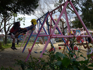
The playground design was excellent. You reguarly saw things like 20-foot high slides that were ten feet wide and which were designed to be extremely low friction -- low enough that it wasn't possible to climb up the slide. The kids went down that thing fast! Yes, those are kindergarteners in that picture.


These children had no fear. I recall a playground at another kindergarten which had 15-foot high poles going straight up in the air. Kids of six or seven would climb straight up, hang from the horizontal bar, and laugh.

These kids would really get into the games that we played. Take, for instance, a game of duck duck goose. It was hilarious for all of us everytime a kid slipped and sprawled and skid halfway accross the floor because he was going so fast.

The kids were also sweet and had a good sense of right and wrong. For instance, if you left your wallet full of cash somewhere, then they'd find you and bring it to you. They wouldn't even peek inside.

These kids listened to their teachers. As rowdy as they usually were, when it was time for class, they would sit down and pay attention.

These children were also the nicest childern I have ever met. At the ten kindergartens and two elementary schools I taught at, never once did I see a child treat another child unfairly. Isn't that amazing?

These were also the happiest children I have ever seen. Of the 750+ children who I taught, I recall one time, just once, when I saw a kid not smiling. She wasn't sad, she was just not smiling. In America, her expression would have passed as "normal". However, at the school, I saw during the couple hours I was there, a dozen classmates and several teachers ask her with a concerned look on their faces, "daijobou ka?"

I used to teach at two elementary schools as a high-school student in America. The children there were extremely sweet, but it also had a lot of elements that I found largely absent in Okinawa. For example, in Okinawa, there were far less children acting like they had ADD, there were far less children bullying others, and there were far less children who were overweight and eating fries. What a disparity!

Okinawa has one of the highest life expectancies in the world. This is attributed to, in part, the diet high in goya (bitter melon), seafood, and most deliciously, pork. However, I think it's also because the lifestyle that the children have here is really, really, really healthy.


From Okinawa, I learned that happy is healthy, healthy is fun, and fun is happy. And I also learned (for a fact!) a number of things that are really really fun and happy and healthy:

- constantly running around
- constantly screaming
- constantly horsing around
- constantly being rowdy
- constantly being kids!

Sticky Ideas -- Sticky DS

In our lecture on sticky ideas, Steve Gold introduced stickiness not as an idea, but rather as a product. In other words, what makes an product sticky? I recall a product that was introduced to me several months ago, and which has stuck with me since:


Well, yes, it's just a Nintendo DS. But make sure to buy that hardware that allows you stick a 4 gigabyte mini-SD card in the thing and run whatever you want.

What are some things that this set up can do? Let's see:

A. Emulate

Think about all your favorite DS games. Now imagine being able to load a whole bunch of them on a single cartriage and play them for free. I'm not condoning piracy, this is just what you could do if you wanted to. By downloading Brain Age, a Megaman game, and the new Advance Wars, you've more than recuperated the cost of the hardware. Next, think about how that was illegal as hell, and feel guilty about how you just screwed over all the game programmers and their families, you inconsiderate bastard!

Alternatively, you could download a bunch of freeware games instead.

B. Teach

There is a lot of homebrew software out there for teaching academic subjects. One very well-designed piece of software that was shown to me was a simple dictionary. It was smooth and easy to use. For instance, if I wrote down an Asian character on the touch screen, it would look up the definition in Chinese, look it up in Japanese, translate it to English, and pronounce it for you, if you so chose.

Another neat thing it could do was teach you actual subject matter. For instance, say you were trying to learn another language. It would explain the material, quiz you on the material, pronounce things for you, keep track of the things that you got wrong, go back to the things that you missed, and even give encouragement appropriately. The person who was showing me the product told me, in Chinese, "I felt that I was forgetting my Japanese, so I started using this Japanese program that teaches Korean." Yay, fun!

C. Instruct you on Cooking

Pick a recipe; or, search hundreds of recipes based on what ingredients you have available, the number of people you're serving, the amount of time you'll need to prep, etc. The DS will then go through, step by step, exactly what you needed to do for preparation and show you pictures and explanations on how to do it. The pictures are clear, and the product will even read the steps out loud to you. Everything is well ordered, so your carrots are chopped at the beginning and not right before you're hurrying to throw them in. Furthermore, your hands are probably busy, so you can just set the DS on the counter and voice-activate it. Just say, "next step", "repeat that", "louder", etc! Basically, it's just really well designed (if you like Japanese food, anyway).

In general, there are a number of things that I noticed that made the setup sticky. It was easy to use, it was useful, it was easy-to-use enough and useful enough so that you used it, it was hella personalized (the one that was shown to me was completely pink with a pink stylus and pink earphones). Furthermore, you loaded the applications that were personally useful (For instance, I'd probably have the Japanese - Chinese - English dictionary, but not the Korean or French ones). In the end, everything was so smooth with cute graphics and simple animations -- the thing just stuck with me.

Most of the apps are homebrew, so there is a pretty active community. I heard that high-schoolers in Japan would use it to study, because it's useful (and fun!). For those of you wondering about availability, to the best of my knowledge most of the programs are in Japanese, with English being the second most common.
In any case, I want one!

Introduction to Vital Ideation -- Notetaking

Starting about two years ago, I began to experiment out of neccessity with various methods of taking notes. I had a job that could be tricky at times, hundreds of contacts to keep track of, and a dozen little things that changed every day which I needed to pay careful attention to. I did have access to many of the tools that seem to be so familar to Olin College students: namely, email and outlook calendar. However, I often needed to be able to keep track of events while I was on the move, and it was usually a bad idea to bring a laptop along.

The following are my experiences with but a few of methods with which I played around with:

A. Hipster PDA

The Hipster PDA is a cult classic among GTD fans, but I found it not to my liking. I couldn't stand the bulkiness, and, quite surprisingly, I found that access just took too long. Do you know how long it takes to remove that little binder-clip? I gave up on mine within a week.

B. Small Notebook

I use these to keep track of contacts. When I went to volunteer activities before coming to Olin, I would bring my notebook with me. It was great for collecting people's contact information! I got this one after I moved into the area this year -- hopefully, it will be a lot more full after this summer!

C. Post-Its

So, the picture is kinda how I use them nowadays... Anyway, these were extremely convenient back in the day when I had to work with a phone and a desk. They were perfect for taking quick notes, and you could stick them in visible places or on relevant papers and organize them in whatever way you wished. However, when you were on the move, I found the next method to by much more handy:

D. Index Cards

Unlike Post-It Notes, which will fall apart in your pocket, index cards are durable enough to repeatedly stuff in your trousers and take with you on the go. They are the perfect size, and fold up nicely as well. Back in the day, I used to keep them attached with a pencil as shown in the photograph. These are extremely handy and easy to access for the dozen times a day when I had to jot down a note. As things got done and I crossed them off, or when everything just got too messy, I would copy the relevant information into the computer, into a notebook, or onto another index card.

E. Design Notebook

This is a relatively new note-taking method for me; I only started using it last semester in Design Nature. I used it to write, sketch, and design, and I had all my notes in one place, which ultimately saved a lot of time. I ended up liking my design notebook so much, that I filled the whole thing up partway through the second project! However, this item doesn't seem like the type of thing that was especially convenient to use to just jot things down whenever; rather, it was much better to use as something to take with you to an empty classroom at four in the morning when it's nice and quiet to just sit down and work. Nevertheless, for this course, I carried my notebook with me wherever I went and jotted town ideas when they came up.

Now that I am at Olin college, my laptop usually follows wherever I go. Nonetheless, I find that I still prefer to keep track of a lot of things with the methods that saved my life. The non-electronic methods are simply irreplaceable -- the ability to sketch, the speed with which you can jot things down and convey ideas, the lack of start-up time, the fact that you don't run out of power, the replacability, the feel of pencil on paper, and the ability to sort and organize in a hands-on fashion -- these are reasons why I prefer to take notes the way I do.

The Best 10 Video and Television Ads

10. Pepsi Jimi Hendrix “Phew that was a close one”


  • http://www.youtube.com/watch?v=ao6JntNIPHc

  • In 2004, Pepsi socked it big time at one of the largest commercial rivalries on the planet. Little Jimi Hendrix at age 11 equally spaced between the coke machine and the pepsi machine. Definitely shows the product, and makes excellent play off of the well known coke-pepsi rivalry. Also very funny. Doesn’t directly pitch the products, but ads a lots of “between the line” commentary that the viewer extrapolates from the short.


9. FedEx “Carrier Pigeons”


  • http://www.youtube.com/watch?v=pFGq0j4u15s

  • FedEx has lately had relatively large success with its most recent advertising campaigns. This commercial starts off mildly interesting as the man explain carrier pigeons to his bewildered boss. As the commercial progresses, it just gets more and more ridiculous until he explains how “big packages” are handled. At that point hilarity ensues. FedEx did an excellent job of mixing humor with their underlying message of responsible, efficient delivery systems.


8. Don’t squeeze the charmin.


  • http://www.youtube.com/watch?v=0Bl9uwFiXFY

  • 1960s advertising at its finest. “Don’t Squeeze the Charmin” practically invented reverse psychology and to this day is still joked about (and even used in modern Charmin commercials). A little before my time, but still a classic that deserves to be on this list.


7. 2000 E-Trade “Wasted 2 Million Bucks”


  • http://www.youtube.com/watch?v=BnQMq5wtZcg

  • Okay, this commercial is just plain funny. I mean there’s a monkey dancing and two really out of beat guys playing along. Beneath this very simple humor, however, is a grand story about dot-coms at the turn of the millennium. The dot-com fever in silicon valley ran so high that venture capital money was flowing by the millions from all corners of the street. This ad represented the epitome of one of the big dot-coms of the day. The complete divergence from a “normal” advertisement ensures that it catches your attention and the monkey with the etrade logo definitely gets the name out there. For those in tune with the times, people caught on to the underlying message.


6. 2001 E-Trade “Chimp on a Horse”


  • http://www.youtube.com/watch?v=ONZFkqzuMjI

  • This one directly is intentionally placed right next to the 2000 E-Trade commercial. These two commercials actually say a lot about the time from which they represent. The chimp on a horse passes by the shadows of the dot coms after the bubble burst to the sound of dreary music and a ghost-town like scene. Then just to sum it up at the end, a sock puppet lands in front of the monkey who starts to cry. That sock puppet was a play at the iconic logo of pets.com. In 2000 pets.com had millions of startup money and flopped when the bubble burst. Once again, has e-trade’s logo prominent and makes a great 1-liner punch at the end: “Invest Wisely.”


5. Budweiser “Whassup” (Original 1999)


4. Budweiser “What are YOU doing?”


  • http://www.youtube.com/watch?v=K7iv7VNTkEA

  • This was the Budweiser making fun of itself in an incredibly masterful way and creating one of the funniest cultural phenomenons that made the Whassup campaign only more successful. The original whassup campaign made characters doing something so completely outlandish that it instantly became an aspect of pop culture. After some continued pushing by Budweiser, most notably the “What are YOU doing” ad, they secured “whassup” forever in the popular culture dictionary. And yet, they also successfully placed the actual product at the critical beginning and end of the ad. “Watching the game, having a bud” is also associated with this cultural masterpiece.


3. Dove “Evolution”


  • http://www.youtube.com/watch?v=iYhCn0jf46U

  • This exceptional video made by Dove as part of their “Campaign for Real Beauty” is a masterpiece of a film and became an instant internet phenomenon. While not directly advertising any product, they ad conveys a very well executed and powerful message that made itself well known in the online community. It even spun off a lot of parodies. One of them is done almost as well as the original. http://www.youtube.com/watch?v=7-kSZsvBY-A&NR=1


2. Microsoft redigns the ipod


  • http://www.youtube.com/watch?v=aeXAcwriid0

  • This isn’t necessarily a widely televised ad per say, but it is still an effective marking gimmick that became instantaneously successful on the internet. This video is actually written by the Microsoft internal graphic design department as a “what not to do” video. It was done so darn well that it makes a powerful, yet extremely entertaining statement about the two companies. Great music, really good design, and funny comments easily place this on my list


1. 1984 Apple Macintosh Commercial


  • http://www.youtube.com/watch?v=OYecfV3ubP8

  • A lot of hype, an excellent theme, and some great cinematography is what puts this one on the top of my list. This is probably one of the most famous ads of all time and demonstrates a dark fantasy that George Orwell + Ridley Scott can do so well. From a design perspective, this ad is visually powerful and emotional. The dramatic contrast between the sporty female hero and the bleak oppressing Orwellian background is subsequently imbued upon the release of a computer system. Extremely effective subconscious branding. No product is being pitched here. No slogan is being said. Just a really cool commercial

Ownership in the 3rd World

Shortly after Presdient Miller came to talk with us, I had a chance to speak with some representatives of the World Bank. They came to Olin to hear about how we built our school from the ground up, because they were interested in doing the same thing in 3rd world countries. The World Bank initiatives in higher education were set up to establish tertiary education institutions all over the world in 3rd world and developing countries. Throughout this meeting, the one principal that stood out to me most was the concept of ownership that we had discussed many times before throughout vital ideation.

I also remember when we were talking to Presdient Miller how he commented on the great sense of ownership that one feels in the establishment of our school. When we have this sentiment in place, everyone feels like they are a part of the system and each in turn contribute a large amount of effort and energy back into the school. While this is partly due to the fact that we are new, small, and filled with a unique brand of people, the concept of involvement through ownership is still something relatively universal.

The parallel that I saw most between Olin and World Bank funded colleges elsewhere in the world is that if students can be involved in feeling like they can actively contribute to the foundation of the institution, then they can create a continual sense of ownership as it evolves.

The principals of ownership in the 3rd world also extend beyond universities. I think that one of the reasons that many NGOs and free-stuff campaigns in 3rd world nations don’t perform as well as they should is because of an inherent lack of accountability and ownership. For example, for a long time, major AIDS campaigns in Africa were devoted to delivering large amounts of free condoms to people. One problem was that since they were free, the condoms were valueless. If those condoms, however, have a small amount of value attached to them, then even though they are still near free, they still have some value associated with them. People buy those condoms with a little bit of their own money and suddenly own them. Giving away free things is not necessarily an effective way of engaging people.

This principal of ownership is another reason why I think that entrepreneurial ventures in the small scale are a great way to help promote growth in 3rd world countries. Business over there does not mean starting a multi-national food chain; rather it means starting a small corner-side shop, or providing a needed serves and capitalizing on it. This provides not only a stimulus to an impoverished economy, but also instills a sense of ownership in the many business owners of these many small businesses. Once they have a vested interest in something that they own and care about, they are far more likely to make a more dedicated and positive contribution towards their cause.

This is the message that the Babson Global Outreach through Entrepreneurship tries to convey with their trips to third world countries. Their mission is dedicated around instilling entrepreneurial spirit into places such as Uganda or Sri Lanka.

Whether it be a new college in Needham Massachusetts, USA, or a home-made jewelry stand in Mozambique, having ownership in a shared creation can be a powerful motivator to inspiring individuals and producing positive results.

Video Games: The Epitome of Fun?

Barry Kurdowitz, the MIT Toy Professor, came to talk to us, he identified various areas that make something a toy and make something fun. He identified a toy product as something designed to function primarily for play. Furthermore, there were various aspects that identified types of play. The ones that Barry used were sensory, fantasy, construction and challenge. He then went on to identify that these four attributes could be almost used as the axis of a graph to identify how various toys were used and perceived.

As Barry was talking about these various aspects, the examples he used were very distinctly physical and tangible toys. They included everything from dolls to Nerf guns to a cardboard box. For some reason he very briefly mentioned the realm of video games, but these electronic forms of entertainment were definitely not the focus of his presentation. While I think that Barry was right to not include the market of video games into his presentation, I believe that this can-of-worms is revolutionary in the fact that many video games exemplify everything that Barry defined to be “fun.”

The video game industry is an enormous international market with many different outlets. The NPD group reported that the video game industry was worth on the order of $10 billion. When I look at many of the extremely popular video games, I see many of them masterfully encompassing nearly all of Barry’s four qualities that he talked about. For example, look at the Massively Multiplayer Online Role-Playing Games (MMORPG). There are an estimated 16 million subscribers for all MMORPGs, of that about 10 million are subscribed to the extraordinarily popular World of Warcraft series.

The common thread between many of these MMORPGs is that your avatar enters a massive world with millions of other players and embarks on social and self-enhancing quests. These games are extraordinarily sensory with rich visuals and sound. They have enormous degrees of fantasy as magical kingdoms or far off space battles unfold. They are highly constructive as players spend enormous amounts of time building their optimal character. They are finally very challenging as players are faced with increasingly more difficult tasks to encounter.

From the perspective of sensory, fantasy, construction, and challenge, video games such as MMORPGs should be one of the most “fun” things you can do. To an extent, this is true for some people as World of Warcraft is notorious for being overly addictive and destroying lives. However, if video games are the ultimate of “fun,” then why aren’t there more people playing video games?

This question is an extremely controversial one that can argued forever. However, I think that there are few very significant factors that prevent things like MMORPGs from becoming the ultimate in “fun.” First of all, there are lots of social stigmas placed against many video games. While many people may find World of Warcraft “fun,” most of them may not be inclined to partake in the activity in the first place. Even though there are video games that encompass many different fields and many different subjects, many people are still adverse to the concept of drawing their entertainment from a video screen.


This leads to another very interesting limitation in video games. For the most part, they are not tangible things. One crucial aspect about “fun” activities is having a tangible object to interact with. The idea of interacting with a mouse and keyboard is unappealing to many, but when the Wii introduced a whole new way of tangible interaction, an entirely new market of gamers was born.

Now what if we could take this abstraction to a whole new level in the future?

What if the games we played were extremely tangible? Imagine a video game that had the richness and depth as a modern MMORPG but could become something that was extremely real and tangible. This is starting to sound a lot like a “Holodeck” from Star Trek or other similar science fiction show. However, this is one of the reasons why I think a true holodeck is a very bad idea. If we made something that could tangibl fulfill our sensory, challenging, and constructive fantasies, then would we have something that was too fun. Would the addition to something this fun be overwhelming to society? Luckily, nothing like a holodeck exists…. Yet.

Modern Art

Kandid's Gallery:

The images shown here are true works of modern art pulled directly from metropolitan museum of modern art. They are all works by one eclectic artist named Kandid. Imagine each of these paintings framed on well-lit wall. Imagine the plush benches and the midst of minimalist spaces with people slowly passing from painting to painting. Imagine people in hushed tones conversing about their perceived perceptions of these intricate images. “Where do these colors come from?” “Are they abstract representations of a bleak and sordid life of the artist interwoven amongst the faint outline of a flawless circle – a circle representing a flawless harmony found within the simple color palette?” When put in this kind of setting, and perspective, these small thumbnails come alive. They suddenly are more than various colored pixels, they are expressions of humanity – they are art. When I look at these images, I can see a carefully constructed human decision to express meaning and message with these colors, shapes and patterns. In the perspectives of modern art, they are very interesting and common examples of abstractness of human emotions, thoughts, scenes, and desires.

Even though these paintings seem abstract, the carefully selected combinations of colors, lines, and patterns serve a purpose to the whole of the painting. They represent the optimal point in the artist’s ultimate creative vision. Just know something about the artist, Kandid, I know that every single stroke and line is there for a purpose. When you know that every gradient and curve has thought, intention, and purpose, we begin to realize that seemingly random patterns in these images may not be random at all. This only exemplifies our appreciation for the artistic mastery of Kandid’s art pieces and justify the hubbub they are creating on the stark walls of this world-renowned art gallery.

Now please, before reading on, take a few moments to look at these works yourself. Take some time to analyze what Kandid was trying to convey with these three different and unique pieces. Talk about what it means to you and what you think it meant to Kandid.

The Art is in the Maker:

I think it’s now time to talk a little bit about Kandid, the artist that I’ve been raving about for the past few paragraphs. Kandid is probably one of the most unusual artists whose pieces you will analyze for their detail and intricate nature. Kandid actually has a webpage here: http://kandid.sourceforge.net/index.html . As I’m sure you’re aware of by now, Kandid is not human at all. In fact, it is a very sophisticated computer program that utilizes a new hot piece of computer science technology known as genetic algorithms. From the website:

“Kandid is a system to evolve graphics. Graphics, in Kandid, is not drawn by hand. Instead new forms can be found using genetic algorithms. To achieve this aim Kandid simulates evolution using sexual reproduction and populations. But there is no fitness function inside the program. Only the user decide which images are interesting."

To simulate evolution Kandid uses crossing over, mutation, populations and has a gene data base. Image calculation is based on Lisp like expressions, Iterated Function Systems (IFS), Linear Cellular Automata (LCA), Voroni diagrams, Lindenmayer Systems (L-systems), and layered textures renderd by Persistence of Vision”

Ecomimicry:

The question I rhetorically ask now is “Are Kandid’s productions Art? Can Kandid mimic human expression through art?” It is true that Kandid put a lot of “thought” into the color of every pixel and the direction of every line. Furthermore, Kandid used a process that is inherently very biological. Evolutionary and genetic algorithms rely on the process that got humans to where they are today. No two paintings will be exactly alike, just as no two biological offspring will be exactly alike. Each of the drawings that Kandid’s algorithms produced is unique and one of a kind. Can we say that Kandid did in fact create something unique?

While these may be just images and our minds may be relatively resolved one way or another, I also want to pose the question of what happens when our computer algorithms begin to mimic ecological functions such as evolution and genetics on a scale many orders of magnitude more complex than they are today. If a computer’s mimicry of nature approaches perfection, and we can no longer distinguish the end product of the two, then how do we determine ecology from ecomimicry?

What's happening to play?


What’s happening to play?

Here’s a cool idea: give your kid a box. It’ll keep her entertained. And guess what? It’s cheap!

The interesting thing about toys is that kids have no say really in what gets bought. Parents make the final call on all purchases. And parents buy things they think are cool. Depending on a parent, a kid might get educational toys, or maybe they’ll get something outrageous and loud.

The thing about kids is that they’re really creative. Kids all over the place love to play with simple things like boxes, so why do we spend so much money on toys?

This questions hits pretty close to home for me since I have two sisters ages 4 and 9. I know it wasn’t too long ago, but when I was a kid, my sister and I kept each other company. We designed elaborate worlds with our friends to play our games in. One of my friends and I spent countless hours digging a hole in her backyard (in hopes of making a fort.) Every time we had a play date we’d dig deeper, for about a year. Somehow this kept us entertained. It must have made things easy on her parents too! And remembering all of this, I can’t remember a single toy that I used to be attached to. I had a calculator that I’d play with, and maybe a few plush animals. I remember playing with Hot Wheels and Polly Pockets occasionally, but mostly with things like Lego’s, Tinker Toys, and K’nex. Maybe this toy list for me happens to reflect my gravitation toward engineering, but I also feel like the toys I used to play with were things that let me be creative. Sure, K’nex gave me a little book to start off with, but after that I could just build whatever I imagined. And I never had trouble keeping myself amused.

The worst thing I can remember as a kid was running errands at Home Depot. This store was designed for people fixing up their homes-the last thing a kid wants to do. My sister and I used to go to the paint section together and play with all the different colors. After that we’d look at the countertop tile samples. We’d try to collect as many as we could every time we went. It was a game to try and remember how many we already had, and not to take too many that the man at the counter noticed.

So what’s wrong with the toys today? They’re educational, aren’t they?

Honestly, I can’t stand them. Maybe I’m idealistic about my childhood, but I see my sisters today who start whining as soon as they are apart from their Gameboys and Pokémon cards. I’ll usually try to suggest a game to them, but to no avail. They need something to keep them entertained. And this worries me a little. I guess it stands out because I can see the difference so clearly between my childhood and my little sisters, only about 10 years apart. I guess what bothers me about it is that as we (the toymakers) define a world more and more for these kids to play in, this leaves less and less room for the kids to imagine. And when you can get online and go to Neopets.com or to webkinz.com, why bother using your imagination? It’s all right there in front of you.

Play has transformed from some creative, fun interaction to some now form of managing assets given to you online, or playing by someone else’s rules. This is still play, but it’s radically different from my definition of play. I know this doesn’t tie into the idea of design too much, but my point here is that there’s an art to designing for fun. And that lies in the ability to create something that children can interact with in a way that allows them to fully be themselves, not something that constrains them to operating inside some outwardly defined criteria.

Teaching + Digital Communications = Multidisciplinary Fusion!


On the subject of radical interdisciplinary design, we discussed in class the fusion of music and engineering, something I’m sure we will see posts about in the upcoming days. What I would like to talk about is the fusion of two disciplines which I have personally spent a lot of time thinking about before vital ideation, and am really excited to share with others. At first glance pedagogy and digital communications seem to have little in common. In fact, the notion of pedagogical research going hand in hand with network signaling and digital communications research seems outlandish and foreign at best. The thing is, any two disciplines must overlap in potentially powerful ways, and these two are no exception.

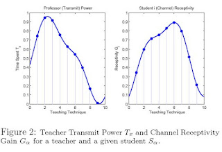
You can see from Figure 1 that the transmitter/receiver model is at least at a very basic level analogous to a teacher/student model where a lesson is transmitted to a student via some sort of signal. In this model a student’s receptivity to lesson X is based off their receptivity to specific teaching techniques. These techniques are used to varying degrees by a teacher, which can be depicted as the power spectral density of said teacher/transmitter’s transmit power, which in turn represents the amount of time teachers spend using a specific type of teaching technique. Figure 2 is a visual way to represent this last paragraph. You can see from the graph on the left, which shows professor “transmit” power as a function of the amount of time (shown on the vertical axis) they spend covering any material using different teaching techniques (shown on the horizontal axis.) Likewise the graph on the right shows student receptivity to different teaching techniques.

What a mouthful. To attempt to explain how this model might be useful, we consider the simple case of 30 students and a choice between two possible teaching techniques, Qa = Auditory Learning and Qb = Visual Learning. You can plot a student’s receptivity to these two teaching “techniques” on a two dimensional grid, where one axis is Qa and the other is Qb. The axes would range from 0->1 for each technique, where 1 is the hypothetical scenario were you as a student understand EVERYTHING that you learn using a specific technique. The ideal student would of course have a receptivity of 1 for both these values, but that wouldn’t make our model useful. The vector G1 would represent the 2-D vector representing these two student receptivities. We can create 30 students with randomly generated receptivity vectors [G1, G2, …G30] such that each student’s total receptivity||G|| is within an arbitrarily-defined range such as 0.3 < || G|| <>

Now, in the digital communications world you represent the power spectral density of a signal by multiplying the transmit power and channel receptivity. For us this means that in order to determine amount learned we can multiply the learning technique time distribution vector (in our 2-d example) for a professor by a student’s receptivity vector (for the two techniques) to give the amount “received as a signal” by a student from each “technique” The sum of the area under this student curve is the “amount learned”!

I will conclude the following post with an explanation of the following figure, which shows the example case of our 30 randomly generated students and the imaginary teacher who hypothetically could teach them any possible range of two specific techniques. What this translates to in the end is the following choice for a teacher: How much time do I spend say, watching videos as opposed to lecturing? Now, this case is obviously ideal because we can’t assume that we will know the exact “receptivity” of each student to a specific technique, and that this directly translates to amount learned, but in this end this is just a model of a teacher/student system. Every model is broken right? The only perfect model of a classroom environment is the classroom itself!

Each parabola shown in the figure above represents the projected learning efficiency E for a given student across the different mixes of auditory and visual learning techniques output by a professor. The vertex of each parabola corresponds to the student being taught by a teaching style that most perfectly matches his(her) receptivity Gn This value corresponds to the mix that represents that student’s highest learning efficiency. If we were teaching only one student, we would therefore choose the Auditory-Visual mix to coincide with the student’s vertex in this plot. However, we must teach to the entire class; so how can we select the direction of Tx? If our goal were to teach at a rate that did not exceed any student’s learning efficiency, the plot above implies that we should select about an equal mix of Auditory and Visual techniques, and we should choose a teaching rate (i.e. learning efficiency) of approximately 0.27. Qualitatively speaking, this corresponds to the highest learning efficiency in the plot that is below every parabola (or, the teaching rate below every student’s maximum learning efficiency). Instead of choosing this “lowest common denominator” approach, we may elect to forgo the few students with the lowest receptiveness in order to increase our teaching rate. Based on our understanding of the figure, any intelligent selection will exist at either the intersection of two parabolas or at the vertex of a parabola. We therefore limit our search to these points. You could envision a graph where you highlight only these two types of points and as you eliminate students you would move further up on the graph and around to different points to maximize the learning efficiency for the remaining N students.

The process for choosing this path up the graph can also be described intuitively as follows. Imagine you pressed a single finger up from the bottom of the last image shown. It would naturally center itself at the highest vertex or parabola union, which corresponds to the teaching technique mix (and the maximum learning efficiency threshold) that you would use to teach all 30 students. Next, say you wanted to exceed this threshold; you would effectively “ignore” one of the lowest parabolas and move to the next highest available point. This would be akin to teaching above the maximum learning efficiency for one of your students. This allows your technique mix to adjust itself to find the next maximum point. We can also plot the learning efficiency threshold height as a function of the number of students above the threshold; as discussed above, you can expect the maximum available threshold to increase as the number of students above the threshold decreases. With one student, assuming of course that our professor can transmit something perfect to that student’s receptivities, you achieve a learning efficiency of 1. With a decreased number of students under the threshold you achieve a lower perfect teaching efficiency for those students.

You could envision a scenario in this model where you chose your teacher signal at a point along this “path” up the vertexes and parabola union points that would maximize the overall amount of learning in the classroom. The “perfect learning efficiency” model up to this point hasn’t taken into account the fact that in the end the choice of a teacher’s T vector will lie somewhere on the 2-D student receptivity space for each student, and that on this space each student has their own perfect learning receptivity point. A teacher wanting to optimize his signal output would first decide an acceptable threshold for student learning, and then determine which of these points minimizes the distance between all the students he(she) is trying to teach for.

I welcome others to come up with two other seemingly random disciplines and merging them together somehow! I'm sure you can think of something in a quick 10 minutes. The basic idea for this post came about after a discussion asking the question "What if all knowledge could be plotted on a n-dimensional grid?" Without meaning to this successfully put linear algebra and digital communications in the same discussion space as pedagogy and learning. There are many more questions where this one came from, the real question is, do you ask yourself silly questions often enough to find real value in some of them?